
Relationship Visual
Explore the relationship between metrics.
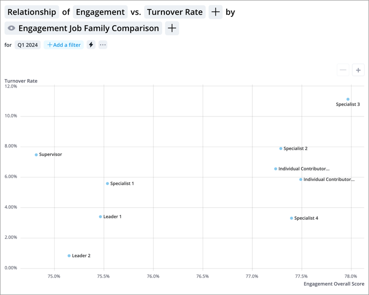
The Relationship visual is used to explore the relationship between metrics. A metric is plotted on each axis and each item on the visual represents a group. The nature of the relationship between the selected metrics is determined by how the data points are distributed across the chart.
This visual supports up to three metrics. By adding a third metric, the data points are replaced with bubbles and an additional dimension of the data is added. The size of the bubble reflects the magnitude of the third metric value, so you can easily identify the differences between groups.
Note: The maximum number of data items that can be displayed is 3000.
How to explore the visual to gain insight
- Identify any patterns in how the data points are clustered to determine if there is a relationship between the two metrics:
- If the data points form a straight line, then there is a linear relationship between the metrics.
- If the data points cluster around a curve, then there is a non-linear relationship between the metrics.
- If the data points are randomly scattered, then there is no relationship between the metrics.
- If there is a linear relationship, look at the direction of the line to determine how one metric affects the other:
- If the line runs from the lower left to upper right of the chart, then there is a direct relationship. The metric values increase together.
- If the line runs from the upper left to lower right of the chart, then there is an inverse relationship. One metric value decreases as the other increases.
- If there is a relationship, look at how the data is spread to determine the strength of the relationship. The more that data points cluster around the line or curve, the stronger the relationship between the metrics.
- Examine any outliers, data points that are located far away from the other data points, by clicking the data point.
- Add a third dimension to the chart by clicking the Add a metric button
 in the visual title.
Tip:
- Quickly switch to the Quadrant visual to conduct four quadrant analysis by clicking the Switch to Quadrant button in the Info panel. For more information, see Quadrant Visual.
-
Right-click on a chart item or data point to open the Visual Item Actions menu. Find actions that will allow you to quickly interact with points of interest. Actions include drilling up or down to view different levels of your data and accessing the Detailed View visual to see a list of subject members or event occurrences that make up a given population.
-
In order for employee photos to appear in the visual the following criteria must be met:
- Your organization has uploaded employee photos
- The visual contains two metrics and a group by
- The visual is grouped by Full Name
- The visual contains 30 data points or less
-
To hide employee photos, click Settings
 on the Visual Actions menu, and then turn off the Show employee photos toggle.